>Crafts series for preschoolers, EDE (2008)

>Art Director/Designer/Illustrator: Gil Martinez
Technique: Vectors

These four crafts books for preschoolers were entirely made in Adobe Illustrator, and the covers are good examples of how I handle vector graphics. In 2009, the books won the prestigious Editorial Excellence Award in offered by the CANIEM, the National Chamber for the Editorial Industry.


>Selected book covers, A la orilla del viento Collection (2007)

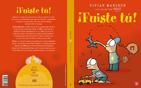
>Art Director/Cover Designer: Gil Martinez
Redesign of the collection: León Muñoz
Illustrators (top to bottom): TRINO, René Almanza, Heyliana Flores, Martha Avilés, Agustín Comotto, Ayax & Mariana Barnes.

Here are six selected covers from the Fondo de Cultura Económica´s A la orilla del viento collection after it was redesigned are good examples of my art direction. I art-directed the first two covers from the conception of each project, and designed the next four from scans of the original paperbacks, since some of the illsutrators have moved, died, or were otherwise engaged, and the original film was lost. You can see three of the covers before the redesign, and the difficulty of negotiating type and logos when I retouched the images. The spines are color coded according to reader level.


>¿Para qué usas la lengua?—What do you use your tongue for? (2007)

>Art Director/Designer: Gil Martinez
Design of the collection: León Muñoz
Illustrator: Jonathan Farr
Technique: Mixed media

I worked at Fondo de Cultura Económica, Latin America´s largest book publisher, as head of the children´s book design department. This proyect was illustrated by Jonathan Farr, a talented illustrator from England who lives part-time in Mexico. The book series aims to teach science to children 3-years old and under.


>Manual Básico de caligrafía e iluminación (1996)

>Author/Designer/Illustrator: Gil Martinez

My undergrad thesis, on type and calligraphy, was a project begun in 1994 and completed in 1996. The work is an excellent primer on the handwritten letterform, and its relationship to printed type. It was published by Universidad Iberoamericana, my alma mater, and it can be purchased from their website. It won a Merit mention in How Magazine’s International Design Competitio in 1997.